

Oct 26, 2025
How Categorizing Tables with Colors Makes Database Design Easier
How Categorizing Tables with Colors Makes Database Design Easier
How Categorizing Tables with Colors Makes Database Design Easier
Learn how color-coding tables by domain speeds ERD reviews, clarifies boundaries, and reduces errors. Plus a quick ChartDB AI walkthrough to apply it.
Learn how color-coding tables by domain speeds ERD reviews, clarifies boundaries, and reduces errors. Plus a quick ChartDB AI walkthrough to apply it.
Learn how color-coding tables by domain speeds ERD reviews, clarifies boundaries, and reduces errors. Plus a quick ChartDB AI walkthrough to apply it.

Jonathan Fishner
7 minutes read
TLDR;
TLDR;
• The problem: Large ERDs where every table looks the same make it hard to scan, review, or onboard new team members.
• How color helps: Assigning colors by domain (billing, auth, analytics) makes boundaries obvious, catches naming inconsistencies, and speeds up PR reviews.
• ChartDB's AI approach: The AI agent scans your schema, groups tables by domain automatically, and applies color-coding in seconds.
• Extra benefit: Combine colors with visual Areas in ChartDB to organize complex schemas into manageable sections.
Introduction
Ever opened a giant schema and felt your brain melt? Every table looks the same. You scroll, you squint, and still can’t tell billing from analytics. Reviewing changes takes forever. Onboarding new devs is a mess.
I’ve been there. That’s why we built ChartDB. In this short guide, I’ll show how color-coding your database tables helps you design cleaner schemas and how ChartDB's AI Agent can do it for you in minutes.
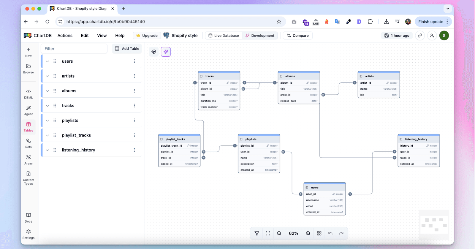
Without colors:
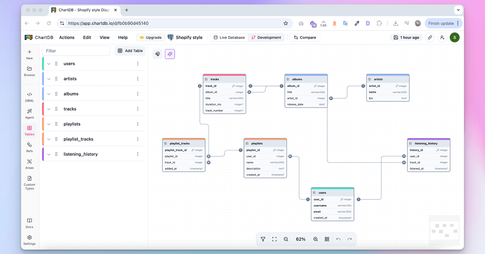
With colors:
Why Color-Coding Tables Helps You Design Better
When every table is grey, everything blends together. But with color? Suddenly, the structure emerges. Here's how color helps at every step:
Scanning Big ERDs
Looking at a diagram with 100+ tables is overwhelming. But when your domains are color-coded, patterns pop out. Want to find billing? Just scan for purple. Done in seconds.
Drawing Clear Boundaries
When domains are mixed, accidental joins happen. With colors, the edges between domains become obvious. It’s easier to stay in the right lane. This visual separation reduces confusion and helps prevent design drift.
Naming and Modeling
If billing tables are purple, you’re nudged to name them consistently: bill_invoice, bill_payment. You catch inconsistencies early. That makes reviews and navigation smoother for everyone.
PR Reviews
When a new table is added in the wrong color or with mismatched naming, it jumps out. Reviewers instantly spot domain drift and avoid back-and-forths later.
Onboarding
New teammates don’t need hand-holding. The legend explains the colors, and the colors explain the schema. Devs ship useful queries on day one.
Query Planning & Performance
Cross-domain joins are often slow and chatty. With colors, you can see when a query path cuts across four teams. It’s a hint to rethink, cache, or optimize.
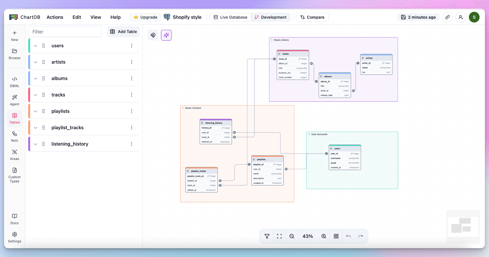
Bonus: Use Areas for Visual Grouping
Colors help a lot, and ChartDB takes it even further with Areas. You can group related tables under a visual block on your diagram. Think of Areas as colored containers that wrap your tables into domains like "Billing", "Analytics", or "Users".
Color plus Area = clarity. You get clean blocks, labeled zones, and structured diagrams that scale. Use both to organize even large, messy schemas in minutes.
Why It Matters
Using color is more than a visual preference, it directly impacts your ability to reason about your schema.
Data Integrity: Foreign keys are essential for preventing orphan records. For example, no invoice should exist without a customer. When visualized with color, these constraints show clear directional links across domains. You quickly spot where constraints are missing.
Consistency: Schema-wide naming rules, prefix patterns, and table relationships are easier to enforce when color shows structure. You can use ChartDB to detect tables that don’t match the pattern or drift from their domain.
Query Power: Join-heavy queries become much easier to debug and optimize when visualized on a color-coded map. If a JOIN crosses four colors, it’s likely crossing four teams or services, that’s a performance hint.
Schema Clarity: Colors make relationships stand out. When teams use ChartDB diagrams in docs or PRs, readers can quickly understand what part of the system the table belongs to and how it relates to others.
How to Categorize Tables by Color in ChartDB
ChartDB's AI Agent makes this process automatic:
Scans your schema and groups tables by domain
Assigns a unique color per domain
Detects junction/link tables and keeps them grey
Adds soft-delete and indexing suggestions
Suggests foreign keys and exports a clean ERD
Want to see it in action? In this video walkthrough, I show how ChartDB's AI agent color-categorizes tables, organizes areas, and prepares your ERD:
Rules That Make Color-Coding Effective
We use a few simple rules internally and recommend them to teams:
Stick to 5–7 domain colors
Each color should mean one thing (use color for domain only)
Keep junction/link tables grey
Light fills, dark text (for readability)
Use the same color scheme in all diagrams
Match table prefixes to domain names
When a table moves domains, rename and recolor it
Add a small legend in every export
These rules keep things consistent and help teams scale fast without losing clarity.
Conclusion
Color-coding your ERD is one of the fastest ways to:
Make big diagrams readable
Spot mistakes during design
Speed up PR reviews
Guide new developers
And when you combine color with visual Areas, you unlock an even better way to organize complex schemas into manageable chunks.
As a founder, I’ve seen grey ERDs hide problems and burn hours. That’s why we built this into ChartDB and let AI do the heavy lifting.
Design cleaner ERDs. Ship with fewer mistakes. Try ChartDB free and auto-group your tables by domain in seconds.
Additional Resources
Introduction
Ever opened a giant schema and felt your brain melt? Every table looks the same. You scroll, you squint, and still can’t tell billing from analytics. Reviewing changes takes forever. Onboarding new devs is a mess.
I’ve been there. That’s why we built ChartDB. In this short guide, I’ll show how color-coding your database tables helps you design cleaner schemas and how ChartDB's AI Agent can do it for you in minutes.
Without colors:
With colors:
Why Color-Coding Tables Helps You Design Better
When every table is grey, everything blends together. But with color? Suddenly, the structure emerges. Here's how color helps at every step:
Scanning Big ERDs
Looking at a diagram with 100+ tables is overwhelming. But when your domains are color-coded, patterns pop out. Want to find billing? Just scan for purple. Done in seconds.
Drawing Clear Boundaries
When domains are mixed, accidental joins happen. With colors, the edges between domains become obvious. It’s easier to stay in the right lane. This visual separation reduces confusion and helps prevent design drift.
Naming and Modeling
If billing tables are purple, you’re nudged to name them consistently: bill_invoice, bill_payment. You catch inconsistencies early. That makes reviews and navigation smoother for everyone.
PR Reviews
When a new table is added in the wrong color or with mismatched naming, it jumps out. Reviewers instantly spot domain drift and avoid back-and-forths later.
Onboarding
New teammates don’t need hand-holding. The legend explains the colors, and the colors explain the schema. Devs ship useful queries on day one.
Query Planning & Performance
Cross-domain joins are often slow and chatty. With colors, you can see when a query path cuts across four teams. It’s a hint to rethink, cache, or optimize.
Bonus: Use Areas for Visual Grouping
Colors help a lot, and ChartDB takes it even further with Areas. You can group related tables under a visual block on your diagram. Think of Areas as colored containers that wrap your tables into domains like "Billing", "Analytics", or "Users".
Color plus Area = clarity. You get clean blocks, labeled zones, and structured diagrams that scale. Use both to organize even large, messy schemas in minutes.
Why It Matters
Using color is more than a visual preference, it directly impacts your ability to reason about your schema.
Data Integrity: Foreign keys are essential for preventing orphan records. For example, no invoice should exist without a customer. When visualized with color, these constraints show clear directional links across domains. You quickly spot where constraints are missing.
Consistency: Schema-wide naming rules, prefix patterns, and table relationships are easier to enforce when color shows structure. You can use ChartDB to detect tables that don’t match the pattern or drift from their domain.
Query Power: Join-heavy queries become much easier to debug and optimize when visualized on a color-coded map. If a JOIN crosses four colors, it’s likely crossing four teams or services, that’s a performance hint.
Schema Clarity: Colors make relationships stand out. When teams use ChartDB diagrams in docs or PRs, readers can quickly understand what part of the system the table belongs to and how it relates to others.
How to Categorize Tables by Color in ChartDB
ChartDB's AI Agent makes this process automatic:
Scans your schema and groups tables by domain
Assigns a unique color per domain
Detects junction/link tables and keeps them grey
Adds soft-delete and indexing suggestions
Suggests foreign keys and exports a clean ERD
Want to see it in action? In this video walkthrough, I show how ChartDB's AI agent color-categorizes tables, organizes areas, and prepares your ERD:
Rules That Make Color-Coding Effective
We use a few simple rules internally and recommend them to teams:
Stick to 5–7 domain colors
Each color should mean one thing (use color for domain only)
Keep junction/link tables grey
Light fills, dark text (for readability)
Use the same color scheme in all diagrams
Match table prefixes to domain names
When a table moves domains, rename and recolor it
Add a small legend in every export
These rules keep things consistent and help teams scale fast without losing clarity.
Conclusion
Color-coding your ERD is one of the fastest ways to:
Make big diagrams readable
Spot mistakes during design
Speed up PR reviews
Guide new developers
And when you combine color with visual Areas, you unlock an even better way to organize complex schemas into manageable chunks.
As a founder, I’ve seen grey ERDs hide problems and burn hours. That’s why we built this into ChartDB and let AI do the heavy lifting.
Design cleaner ERDs. Ship with fewer mistakes. Try ChartDB free and auto-group your tables by domain in seconds.
Additional Resources

Continue Reading


© 2026 ChartDB
Product
Free Tools
© 2025 ChartDB
Product
Free Tools
© 2025 ChartDB